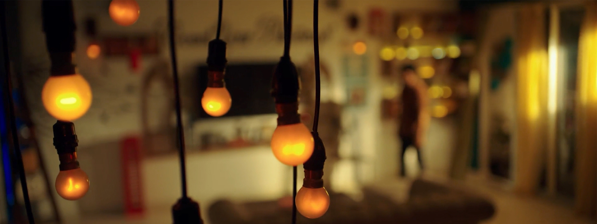
For me, colour is not simply something that makes an image beautiful. Colour is emotion. Colour is atmosphere. Colour is storytelling.
Before an audience understands the dialogue or the situation, they often respond to the visual world of a film—the colours, tones, contrast, and overall mood.
As a cinematographer, I use colour to influence how a scene feels, how a character is perceived, and how one moment connects with another.
A frame can be perfectly composed and beautifully lit, but the right colour can give it a completely different emotional identity.
I don't choose colour just because it looks good. I choose it because it belongs to the story.
What Does Colour Mean to Me?
When I think about colour, I consider more than simply choosing warm or cool tones.
I look at:
- Colour palette
- Colour temperature
- Contrast
- Saturation
- Skin tones
- Production design
- Costumes
- Lighting colour
- Location
- Time of day
- Emotional progression
All these elements work together to create the visual identity of a film.
The colour of a wall, the actor's costume, a practical light, or even an object in the background can become part of the storytelling.
Colour Creates Emotion
Different colours can create different emotional associations.
- Warm tones can suggest comfort, happiness, intimacy, nostalgia, or romance.
- Cool tones can suggest loneliness, distance, tension, night, or isolation.
- Desaturated colours can create a feeling of realism, sadness, memory, or seriousness.
- Highly saturated colours can create energy, excitement, celebration, or heightened reality.
But colour does not have one fixed meaning.
The same colour can communicate different emotions depending on the story and how it is used.
Practical Shot Example: Changing the Mood With Colour
Imagine a character sitting inside the same room.
Version 1 — Happiness
I might use warm, gentle tones with natural skin colour and subtle highlights.
The room feels welcoming.
Emotion: Comfort and warmth.
Version 2 — Loneliness
Now I introduce cooler tones and reduce the overall saturation.
The same room suddenly feels distant.
Emotion: Isolation.
Version 3 — Suspense
I might create stronger colour contrast, allowing certain areas to fall into deeper tones while a specific colour becomes visually dominant.
Emotion: Mystery and tension.
The location has not changed.
The colour has changed the story.
Warm vs. Cool Colour
One of the most useful approaches in cinematography is creating a relationship between warm and cool colours.
Practical Shot Example
A character is standing near a window at night.
Cool blue light enters from outside while a warm practical lamp illuminates part of the room.
The frame now contains two different colour worlds.
The warm side can represent comfort or safety, while the cool side can suggest the outside world, uncertainty, or emotional distance.
This contrast can make a simple image visually richer without adding unnecessary elements.
Colour and Character
Colour can also become part of a character's identity.
Practical Shot Example
Suppose a character begins a film wearing soft, neutral colours.
As the story progresses, their costume gradually becomes darker or more saturated.
The audience may not consciously notice every change, but the colour progression can reflect the character's emotional journey.
Colour becomes a visual representation of character development.
The costume changes, but the story is what gives that change meaning.
Colour as a Storytelling Motif
Sometimes I use a particular colour repeatedly throughout a film.
A colour can become connected to a person, place, memory, object, or emotion.
Practical Shot Example
Imagine a story where a character has an important childhood memory connected to a red flower.
That colour can subtly appear throughout the film—in a costume, a vehicle, a wall, a prop, or a light.
When the red colour appears again during an important moment, the audience may subconsciously connect it with the character's memory.
A simple colour becomes a visual motif.
Colour and Production Design
Colour does not belong only to the cinematographer.
It is a collaboration between:
Cinematography + Production Design + Costume + Lighting + Art Direction
Before shooting, I like to understand the colour environment of the entire scene.
If the background is already strongly coloured, I need to consider how the actor's costume and skin tone will sit within that palette.
The goal is not necessarily to make everything match.
Sometimes contrast is more powerful than harmony.
Using Colour Contrast
Complementary colours can create strong visual separation.
Practical Shot Example
Imagine a character wearing a warm-toned jacket walking through a blue-toned night environment.
The character naturally becomes the visual focus.
The colour contrast helps the audience find the subject without requiring dramatic camera movement.
Colour can guide the eye just as composition and lighting can.
Colour Temperature and Time
Colour can also communicate the passage of time.
Morning
Soft, natural and slightly warm tones can suggest freshness and calm.
Afternoon
More neutral or brighter colour can communicate realism and clarity.
Evening
Warm sunset tones can create intimacy and nostalgia.
Night
Cooler tones can create distance, mystery, or isolation.
These are not strict rules.
They are tools.
The story decides how I use them.
Colour and Memory
Colour can be particularly powerful when storytelling moves between the present and the past.
Practical Shot Example
A character remembers their childhood.
Instead of changing the image dramatically, I might subtly shift the palette—perhaps using softer contrast, warmer tones, or reduced colour intensity.
When we return to the present, the palette becomes more neutral.
The audience immediately feels that they have entered a different emotional space.
Colour can help separate memory from reality without requiring an explanation.
Colour in an Emotional Scene
Sometimes I deliberately reduce colour rather than adding it.
Practical Shot Example
A character experiences a major loss.
Instead of creating an obviously dark or dramatic look, I might reduce saturation and allow the image to become quieter.
The world feels less vibrant.
The audience may experience the emotional emptiness through the image itself.
Sometimes removing colour creates more emotion than adding colour.
Colour and Skin Tones
No matter how creative the colour palette is, I always pay careful attention to skin tones.
The audience needs to remain connected to the character.
If the environment has strong colours, I still need to make sure the skin remains believable within the visual style.
Colour should support the actor and performance—not distract from them.
For me, technical control and creative expression must work together.
On-Set Colour Workflow
Colour should not be something I think about only after the shoot.
For me, the colour journey begins during pre-production and continues through the final grade.
1. Start With the Story
Before choosing a colour palette, I first understand the script, characters, locations, and emotional progression.
I ask: What is the emotional journey of the story?
This becomes the foundation for all later colour decisions.
2. Build a Colour Palette
I work with the production design and costume departments to establish the colours that belong to the visual world.
We can identify:
- Dominant colours
- Supporting colours
- Accent colours
- Character-specific colours
- Colours to avoid
This helps maintain a consistent visual identity.
3. Prepare the Camera
Camera settings and the chosen colour-management workflow need to be established before shooting.
I make sure the camera is recording in a format that gives us the flexibility needed for post-production.
The goal is to capture information accurately and consistently, rather than trying to create the final look entirely in-camera.
4. Control the Lighting
Lighting and colour must work together.
The colour temperature of the sources, practical lights, natural light, and their relationship to the environment all influence the final image.
For example, if I want a warm practical lamp to remain visually important, I need to make sure its colour relationship with the surrounding light is intentional.
5. Check the Image on Set
I don't rely only on how the scene looks to the naked eye.
I monitor the camera image and check:
- Exposure
- White balance
- Skin tones
- Highlight detail
- Shadow detail
- Colour relationships
- Consistency between shots
A properly calibrated monitoring setup helps the creative team make decisions based on a reliable image.
6. Maintain Continuity
If we shoot the same scene across different days, locations, or lighting conditions, I make sure the colour remains consistent.
Reference frames, camera settings, lighting notes, and continuity information can be extremely useful.
The audience should feel that the scenes belong to the same visual world.
7. Capture Reference Images
When necessary, I keep visual references from important setups.
These references help communicate the intended look to the colourist during post-production.
They become a bridge between what we created on set and what we want to achieve in the final image.
8. Final Colour Grade
The colour grade is where the visual language is refined.
I work with the colourist to balance the image, preserve skin tones, shape contrast, control saturation, and maintain continuity.
The objective is not to completely reinvent the footage.
The grade should enhance the visual intention established during production.
Colour Continuity: A Simple On-Set Example
Imagine shooting a character walking from a warm interior into a cool exterior.
On one day, the interior is photographed with warm practical lights.
On another day, the exterior is photographed under cooler natural light.
If these colour relationships are not carefully monitored, the transition can feel accidental.
But when the colour temperature, exposure, lighting, and camera settings are controlled, the transition becomes intentional.
Colour continuity allows the audience to stay inside the story.
One Scene, Three Colour Choices
Let's take a simple situation:
A woman waits alone at a railway station.
The location and action remain the same, but the colour can completely change the emotional interpretation.
Frame 1 — Hope
Warm natural tones with gentle highlights.
Feeling: Expectation and optimism.
Frame 2 — Uncertainty
A balanced but slightly cooler palette with stronger contrast.
Feeling: Waiting and doubt.
Frame 3 — Disappointment
Desaturated, cooler tones with reduced visual warmth.
Feeling: Emptiness and loneliness.
The action remains the same.
The colour changes the emotional interpretation.
That is the power of colour in cinematography.
Colour, Light and Camera Must Work Together
Colour cannot be considered separately from lighting and camera.
The lens, exposure, lighting direction, production design, costume, camera sensor, and grading all influence the final colour.
A colour palette that looks beautiful in a reference image may not work in the actual location.
That is why I believe colour decisions should begin during pre-production, not only in the grading room.
My Approach to Colour
Before shooting a scene, I ask myself:
- What is the emotional tone?
- What colours belong to this world?
- What colour should the audience notice first?
- How should the character stand apart from the environment?
- How should the colour evolve with the story?
When these questions have answers, colour becomes a storytelling tool rather than decoration.
My Responsibility as a Cinematographer
For me, cinematography is a combination of light, colour, composition, lens, movement, and storytelling.
- Colour can introduce a character.
- It can connect two moments.
- It can represent a memory.
- It can create tension.
- It can reveal a change in emotion.
- It can guide the audience's attention.
Most importantly, colour can make the audience feel something before they understand why they feel it.
Colour With Purpose
Before I choose a colour palette, I ask:
- What should the audience feel?
- What should they notice?
- What should remain subtle?
- How should the colour evolve with the story?
When every colour has a purpose, the image becomes more than visually attractive.
It becomes visual storytelling.
Final Thought
Cinematography is not about making every frame colourful.
It is about finding the right colours for the story.
- Sometimes the image needs warmth.
- Sometimes it needs coolness.
- Sometimes it needs strong saturation.
- Sometimes it needs almost no colour at all.
The best colour palette is not the one that attracts attention.
It is the one that serves the emotion without distracting from the story.
A cinematographer doesn't just capture colour.
A cinematographer uses colour to make the audience feel the story.